
Work
Sooo Good
This project is inspirational to me. A friend, after getting laid off, started his own social media consultancy to help other small businesses thrive when it came to social media marketing.
He wanted a brand that had a happy personality, was unashamedly bright, and told a story that social media could be easy and fun. We used bright colours, strong type, and even exciting illustrated overlays to bring Sooo Good to life.
Logo
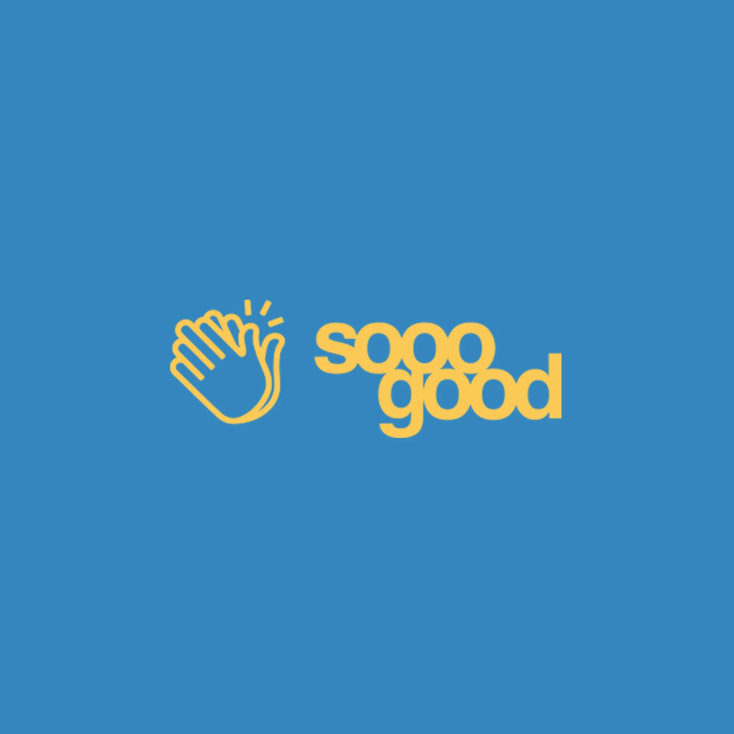
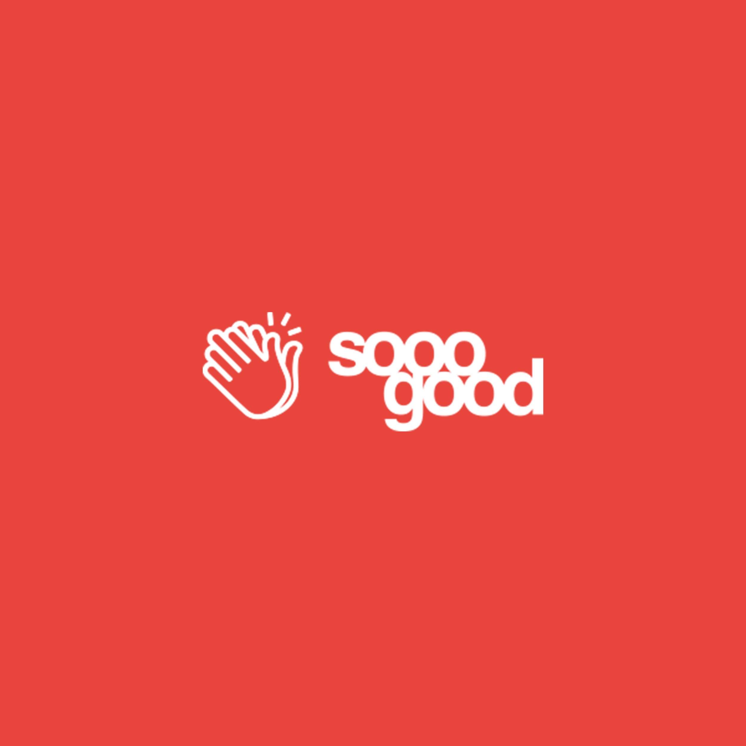
What’s something that almost everyone does when they are super elated? They smile, they laugh, and they HAPPY CLAP!
we created an emoji-like logomark for Sooo Good that felt super whimsical and joyous. We then kerned a neo-grotesque font for the wordmark, which helped amplify the happy vibes.
To take it even HAPPIER, we wanted to mix and match colours of the logo with backgrounds so that we could convey pure fun.

Typography
We were inspired by the bold and simple lines of neo-grotesque typefaces, especially in mid-century modern design.
So, we selected the special Forma typeface for headings, and the stately Franklin Gothic for body text.
Colour Palette
We wanted a colour palette that was simple, but could allow for mixing and matching.
We took colours inspired by the primary colours: red, yellow, and blue. Because when you mix them, you get shades of orange, green, violet, and pink. It was a perfect blend!


